HomBar Project
Distinction Report and Customer Journeys (D)
High Distinction Personas and Website (HD)
For the MKTG3110: Digital Marketing group project, our team's aim is to consult and create a marketing strategy for a newly established online company. Consisting of four members, we created HomBar, a subscription-based protein bar company.
Responsibilities
Designed Report Structure
Created Customer Journeys and Customer Personas
Analysed Target Market
Designed MockUp Website
Final Product
Task
Deliverables
1 | Target Market
Health Conscious Millennials
In 2019, 79% of consumers have snacked on packaged bars (FMCG, Active Nutrition Survey, Q3 2019) and nearly 60% between 25 to 34 years-old looked for health-benefiting nourishments to build up their body's energy level (International Food Information Council Foundation, 2019). Thus, with a growing consumer preference towards meal replacement, ready-to-eat (RTE), and packaged foods among the targeted age demographic (Vlachos & Georgantzis, 2016) millennials between ages of 25 to 34 are targeted customers for HomBar.


2 | Customer Journeys


3 | HomBar Website
Created on WIX
Popup Window
A popup window will appear on the Home Page for a first-purchase discount code for new visitors. As our personas are fast-paced, convenience-led, and price-led consumers, the popup brings value by offering a lower price point. Once subscribed to our newsletter, fortnightly emails on new products, sales, and influencer sponsorship will be sent.
Home Page
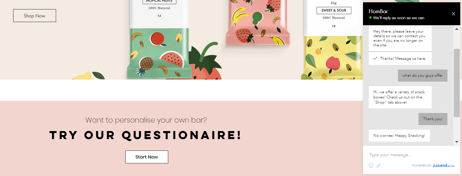
Once the visitor exits the email pop-up, they will be exposed to a large, concise headline: “Eat well, Live well” to communicate our value proposition upfront. Designed for our personas, a “Shop Now” button is conveniently placed below the headline, saving customers time by letting them know from the start if our product is a fit for their needs and can be purchased directly.
Once visitors scroll, they will be met with an education section about our influencer’s collaborations, information about subscription deals, and images of the HomBar community.
Afterward, an array of products appears at the end of the homepage, allowing consumers more consideration time once the website is navigated from top to bottom. The navigation bar follows the visitor’s scrolling direction, increasing accessibility for visitors to explore other pages.
Helping the consumer making the right choice is fostered through titles such as “New Arrival” and “Best Seller”. The word “New” makes customers intrigued by the newest product. While the word “Best Seller” lets consumers know what items are popular among others. This generates indirect word-of-mouth, influences consumer buying behaviour, and grows confidence knowing others also purchased the same product.
Chat Function
On the bottom right corner, the “Let’s Chat” option allows customers to speak with HomBar’s employees instantly for any queries or information. Furthermore, to facilitate trust, a phone number and mailing address are presented on all pages. Contact information, along with a chat function, helps potential customers feel like they’re buying from a real person
Subscription Package Page
On the “Subscription” page, I emphasized the “Gold Membership” by placing it in the middle as the focal point, highlighted the text “Best Value” in bright green, and darkened the text box to draw attention. Utilizing information framing, consumers feel they are lessening the risks of performing the wrong choice, and decreasing dissonance for post-purchase by offering a 1-month free trial.
FAQs Page
If visitors require a human touch to our brand, the “FAQs” page can be accessed. The page allows all visitors to join an existing group or make a new one. New visitors can browse and ask existing buyers about any concerns, queries related to the subscription and product, and tips about relaxation methods outside of HomBar. My aim was to facilitate a platform for dialogue between customers and promote user-generated content for an “authentic buying experience”.


